Understanding Color Theory in Interior Design
Color Your World Color theory is a fundamental aspect of interior design that involves the study of how colors interact and influence our emotions and perceptions. It encompasses various principles, including hue, value, intensity, and temperature, which help designers create harmonious and visually appealing spaces. By mastering color theory, designers can evoke specific moods, create focal points, and ensure a cohesive look throughout a room.
The Color Wheel
At the heart of color theory is the color wheel, which categorizes colors into primary, secondary, and tertiary groups:
- Primary Colors: Red, yellow, and blue are the building blocks of all other colors.
- Secondary Colors: Created by mixing two primary colors (e.g., red + yellow = orange).
- Tertiary Colors: Formed by mixing primary and secondary colors (e.g., red + orange = red-orange).
Understanding the relationships between these colors is crucial for creating effective color palettes in interior design.
The Importance of Choosing the Right Color Palette
Choosing the right color palette is essential as it profoundly impacts the ambiance of a space. Colors can evoke emotions and set the tone for how a room feels. For instance:
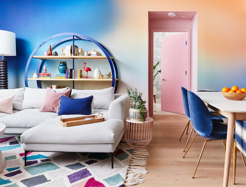
- Warm Colors: Reds, oranges, and yellows can create an energetic and inviting atmosphere.
- Cool Colors: Blues and greens tend to evoke calmness and serenity.
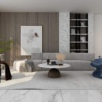
- Neutrals: Whites, grays, and beiges provide a versatile backdrop that can make other colors pop.
A well-thought-out color palette not only enhances aesthetic appeal but also contributes to the overall functionality of a space.
Creating Your Color Palette
Steps to Develop a Cohesive Color Scheme
- Assess Your Space: Consider existing elements such as furniture, flooring, and architectural features that will influence your color choices.
- Understand Lighting: Natural light changes throughout the day can alter how colors appear. Test paint samples in different lighting conditions to see how they look at various times.
- Choose a Base Color: Start with a dominant color that will cover about 60% of the space. This could be the wall color or larger furniture pieces.
- Select Secondary Colors: These should make up about 30% of your palette and can be used for smaller furniture items or accent walls.
- Add Accent Colors: The remaining 10% should consist of bold accent colors used in accessories like cushions, artwork, or decorative items.
The Three-Color Rule
A popular guideline in interior design is the three-color rule. This principle suggests using one dominant color (60%), one secondary color (30%), and one accent color (10%). This approach helps maintain balance while allowing for variety within the space.
Popular Color Schemes
Monochromatic
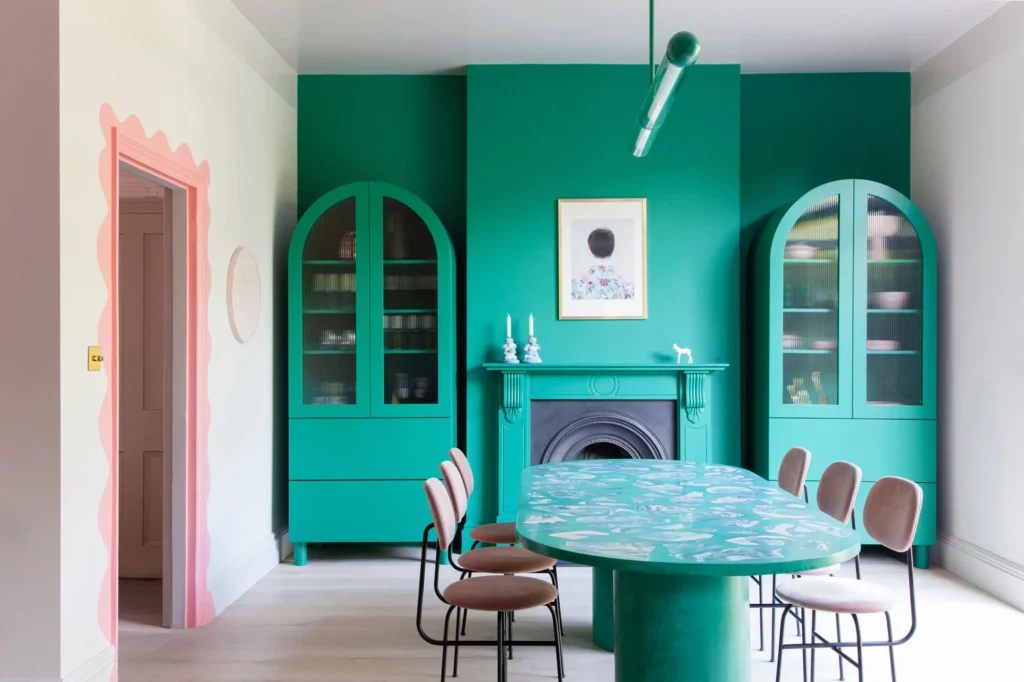
This scheme utilizes variations of a single hue. By incorporating different shades and tints of one color, designers can create depth while maintaining a unified look. For example, varying tones of blue can evoke tranquility while providing visual interest.
Analogous
Analogous color schemes use colors that are next to each other on the color wheel (e.g., blue, blue-green, green). This creates serene and comfortable designs due to their natural harmony.
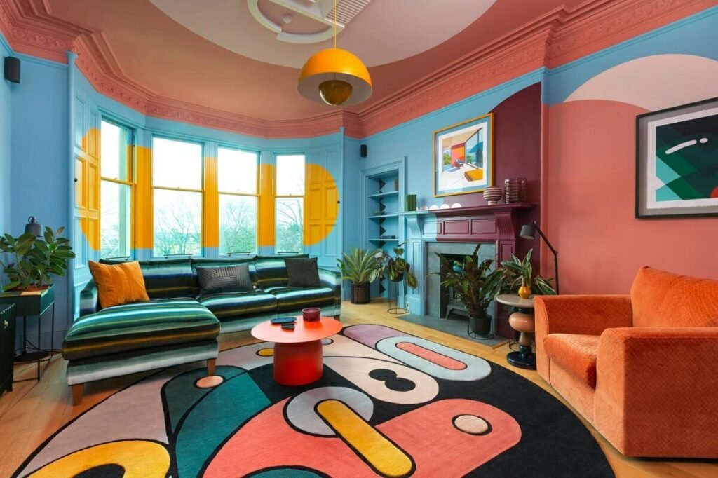
Complementary
Complementary colors are opposite each other on the color wheel (e.g., blue and orange). This scheme creates high contrast and vibrant designs but should be used carefully to avoid overwhelming the space.
Emotional Impact of Colors

Colors have psychological effects that can influence mood and behavior:
- Red: Often associated with excitement or passion; it can stimulate energy levels.
- Blue: Known for its calming effects; it promotes relaxation.
- Yellow: Evokes happiness but can be overwhelming if overused.
- Green: Represents nature; it brings a sense of peace and rejuvenation.
Understanding these associations allows designers to choose colors that align with the intended atmosphere of each room.
Practical Tips for Choosing Colors
- Start with Inspiration: Look for inspiration from nature, art, or existing decor items. A favorite painting or fabric can serve as a foundation for your palette.
- Experiment with Samples: Always test paint samples on your walls before making final decisions. Observe how they change under different lighting conditions throughout the day.
- Consider Room Functionality: Think about how you want each room to function. For example, calming colors might be ideal for bedrooms while vibrant hues could energize a home office or playroom.
- Embrace Texture: Incorporate various textures through fabrics or materials to add dimension to your chosen colors.
- Stay Flexible: Be open to adjusting your palette as you gather more inspiration or as trends evolve.
Conclusion
Choosing the right color palette for your interior design project is both an art and a science. By understanding color theory principles and considering factors such as lighting, room functionality, and emotional impact, you can create spaces that are not only beautiful but also meaningful.
Whether you opt for bold contrasts or soothing harmonies, remember that your home should reflect your personality while providing comfort and joy. Embrace experimentation with colors to craft an environment that truly feels like yours—one that invites warmth, creativity, and serenity into your everyday life.
Also Read : Creating A Balanced Color Palette For Stunning Interior Design